I'm officially craving spring and summer attire. Bright colors are always a go-to, and last year, I sadly didn't really partake in the color blocking trend that graced many of the Spring/Summer 2011 runways. So when my little sissy Brooke suggested I write a blog on bold color combinations I was anxious to see what I missed out on. And in all honesty, the more I searched, the more I fell in love with the color blocking trend. Pairing unexpected hues together (think pink+red, kellygreen+fuschia, coral+tiffanyblue, anyneon+anyneon) can work amazingly well - it's just all about balance. I also found that when done correctly, the trend can give off a great 60's feel. This isn't a trend that everyone is about to go try, so for those who are hesitant, I broke colorblocking up into levels.
LEVEL 1 - Just a Splash
One of my favorite ways to brighten up an outfit is by carrying a bright purse or wearing bright shoes. If the colors contrast enough, it's most certainly color-blocking, regardless of the small scale. I love how in the robin's egg blue in the clutch below contrasts with the bright coral. As you become more brave, add more color. A good starting point is wearing a neutral dress and adding accessories that pop - just make sure accessories all different shades, and all bright.
LEVEL 2 - Built In Pieces
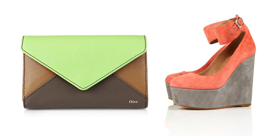
Sometimes, it's easiest to leave the styling up to the experts. Many people shy away from color, especially non-traditional combinations. If you're hesitant to try this look, buy shoes, a bag or a shirt where the color blocking is already done for you. This is a perfect way to get your toes wet without fully committing. The Topshop wedges below and the Chloe envelope clutch are both amazing examples.
LEVEL 3 - Keep Hues the SameThe main goal of color blocking is to notice, above all else, the color combinations. People have been mixing bright, but related hues forever, and although it's not as shocking as some of the color blocking we see today, it's still a beautiful look. Make sure shades are similar, and you'll be just fine. The dusty coral and tiffany blue blouse are not at all unexpected together, but they're still visually pleasing.
LEVEL 4 - Fully Commit to BrightsIf you need no convincing on this trend, here you go. Pair colors that traditionally clash, but the key is to make sure they have the same intensity. I'm loving the bright pink and bright red - they work together because they're equally vibrant. In art class, they teach you that colors directly across the color wheel from each other compliment each other best. Well, this is about doing just the opposite.
LEVEL 5 - 60's Style & Extra ObviousWhen dresses or shirts are divided geometrically by color, you've gone as far as there is to go. This is a trend that was big back int he 60's, and the uber obvious retro-look is so refreshing. Below are looks from (l to r) Herve Leger, Stella McCartney, Diane Von Furstenberg, and BCBG. The creative color combos and literal "blocking" are what we're seeing a lot of this year.


No comments:
Post a Comment